CASE STUDY · WIX · UX DESIGN
Wix Automations Redesign
Rethinking how Wix users create, find, and trust their automations, across a tool that spans the whole platform.
- MY ROLE
- Senior UX Designer, involved end to end
- TEAM
- Cross-team effort across multiple Wix product teams
- PRODUCT
- Wix Automations, 60+ triggers, platform-wide
- FOCUS
- Discoverability, creation rate, fewer support issues
- METHODS
- Competitor research, support analysis, usability testing, prototyping
- TYPE
- Ongoing cross-team redesign
KEY OUTCOMES
What the project delivered
3
Research streams behind the redesign: competitor, customer support, and cross-team requirements
60+
Automation triggers the new system had to support, with more Wix products integrating
10
Users validated the direction: automation experts and potential users
A scannable list view
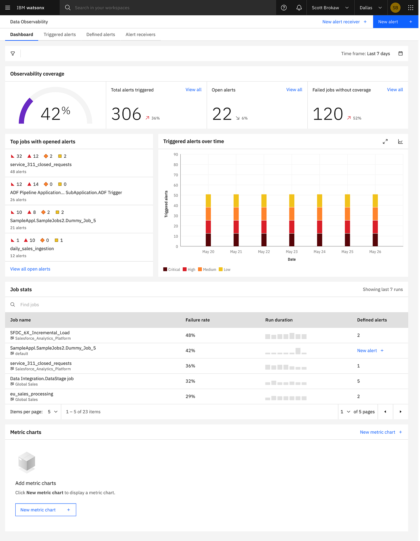
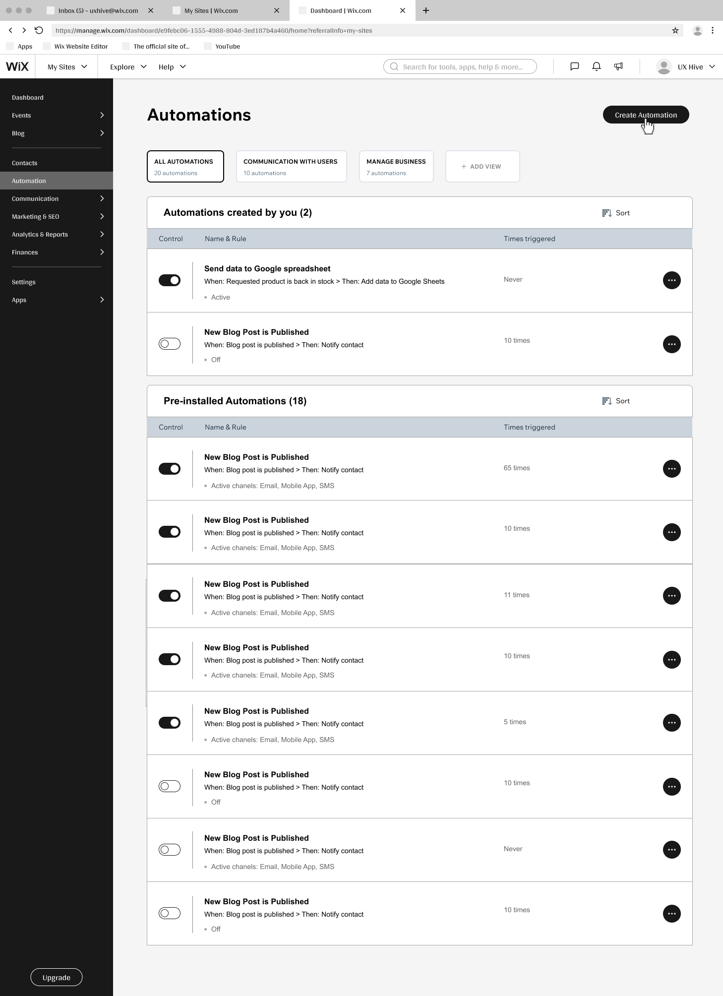
Moved Automations into a table-based list showing name, rule, statistics, and clear CTAs, matching how users actually scan.
Trust through visible stats
Surfaced per-automation statistics so users can see an automation is running, the top complaint from support.
Faster creation from recipes
Leaned into recipes and templates, since most users create automations from them rather than from scratch.
One system across Wix
Aligned requirements from partner teams so automations look and behave consistently wherever they appear.
ABOUT THE PRODUCT
What Wix Automations is
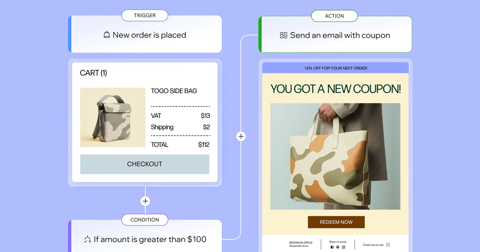
Wix Automations is a tool that streamlines users’ work processes and saves time on manual tasks. It’s heavily used to add functionality to sites, mostly for marketing, but also to run a business more efficiently. At the company level it’s strategic, integrating a wide range of Wix products. When this project started, Automations already had almost 60 triggers, with more Wix products lining up to integrate.
ROLE
My role
As a UX designer, I was deeply involved in every stage of this large cross-team project: problem definition, competitor research, communication with other teams, usability testing, and a number of off-sites. It was a complex, ongoing process rather than a single hand-off.
THE GOAL
What I set out to change
Increase the creation rate for Automations, improve its discoverability, and reduce support issues. Automations had grown complex over the years. The project began as an initiative to make it friendlier for both advanced and simple users, and it soon became clear it was a cross-team effort: one that meant rethinking not just Automations, but all automated actions across Wix.
- ↑ Creation rate
- ↑ Discoverability
- ↓ Support issues
BACKGROUND RESEARCH
Understanding the problem
I approached the redesign with several streams of research, each one cross-checking the others.
Competitor research
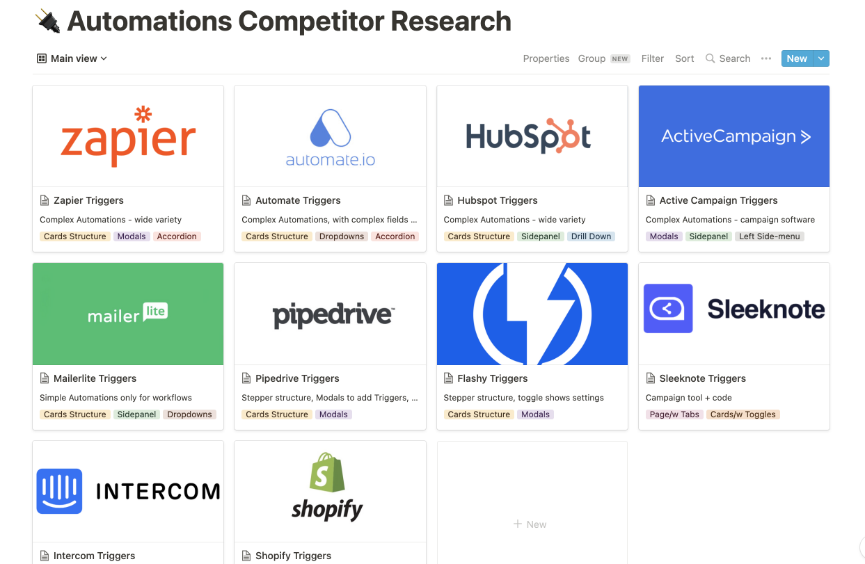
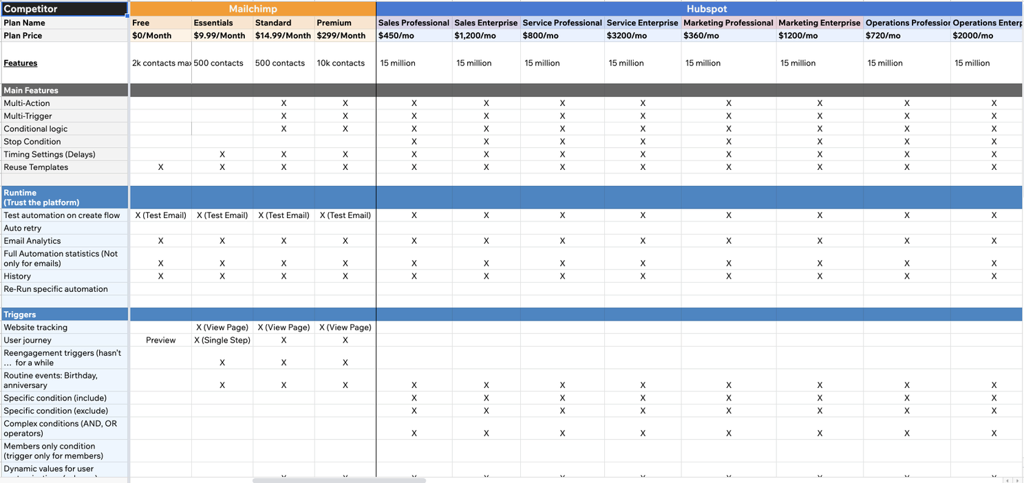
The project required thorough direct and indirect competitor research, run in several iterations to test assumptions.
MAIN FINDINGS
- All competitors use a table view.
- They expose the main info about each automation: name, rule, basic statistics, and main CTAs.
- They offer search and sorting.
- They provide an aggregator page listing all automations.
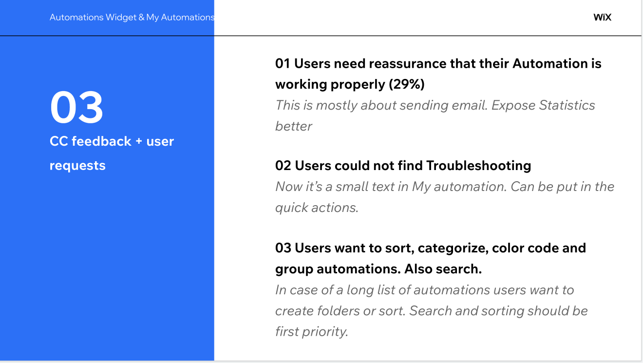
Customer support data
Feedback gathered from customer support confirmed the assumptions and findings from the competitor research.
MAIN FINDINGS
- Users can’t find statistics about an automation, so they’re unsure it’s running.
- Users often struggle to trust that an automation is actually running.
- Users want more ways to scan, sort, and group their automations.
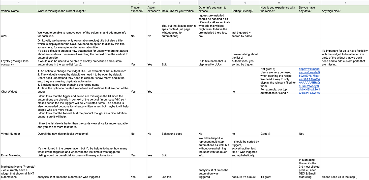
Other Wix teams’ requirements
Because Automations integrates with many products across Wix, I collected requirements from the other teams that expose automations on their own pages, so the redesign would work for the whole platform, not just one surface.
USABILITY TESTING
Testing the assumptions
To check the assumptions from the preliminary research, I ran usability testing sessions with two groups of users:
Automation experts
Power users who rely on automations day to day.
Potential automation users
Users who haven’t adopted automations yet.
OPEN QUESTIONS
- How users find an automated process in Wix, and whether it’s clear.
- Whether the current Automations page structure is clear to users.
- How users create new automations.
- How users find the automations they’ve created, and identify them.
Prototype
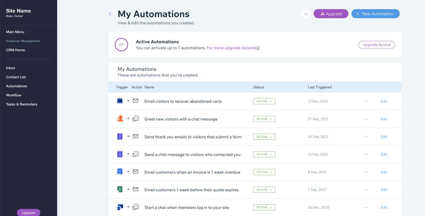
I collaborated with the prototyping team to build a code-based prototype that imitated the product, so I could test the assumptions on something that felt real.
WHAT THE SESSIONS REVEALED
- All users preferred a list view.
- Many used the basic statistics in the table to tell whether an automation was running or efficient.
- Many created automations from recipes, not from scratch.
- Two of the pages were confusing.
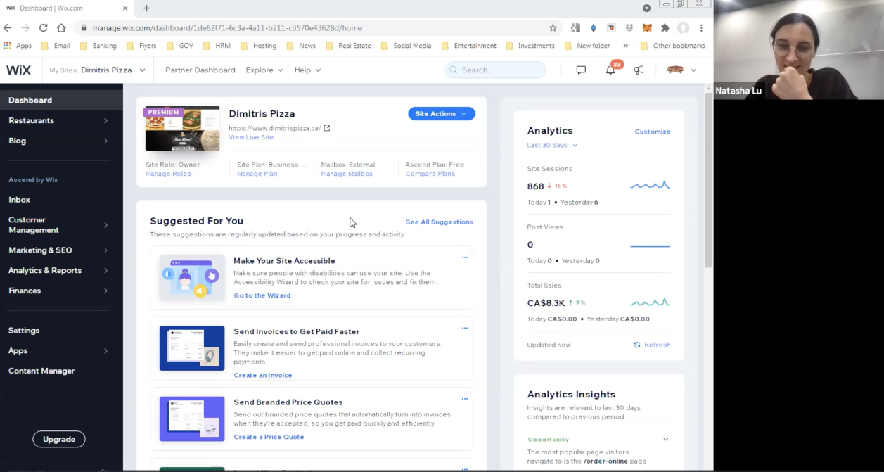
- Users weren’t aware of the pre-installed automations.
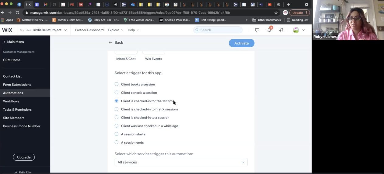
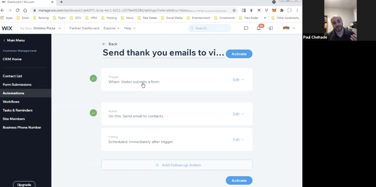
FROM THE SESSIONS
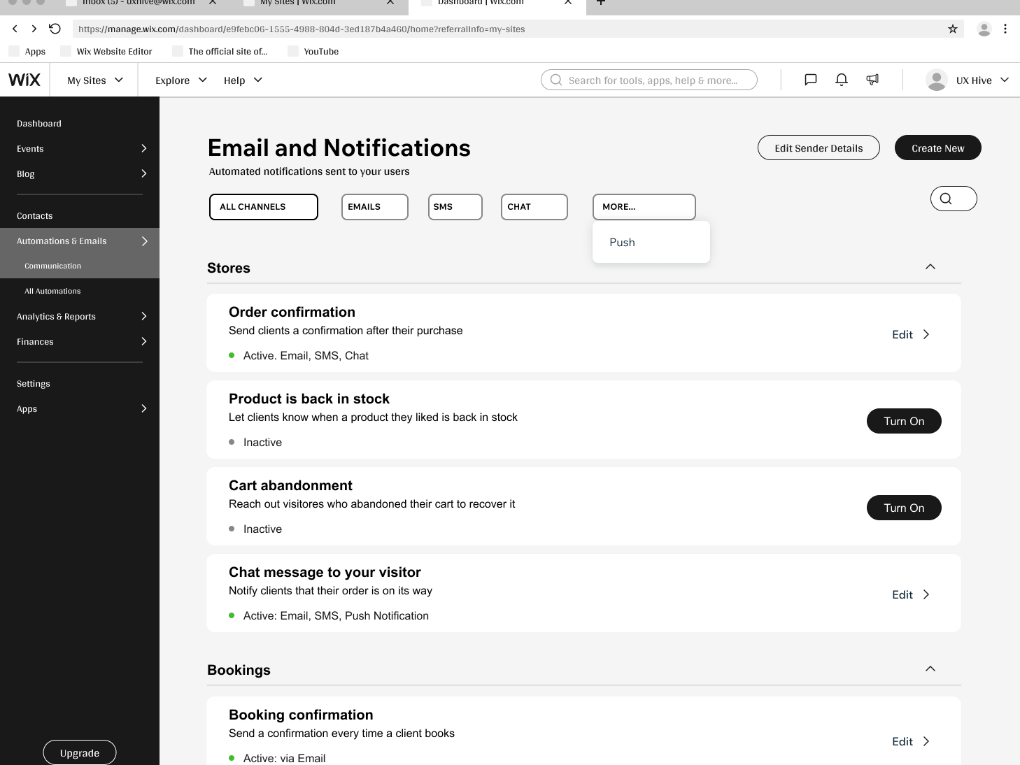
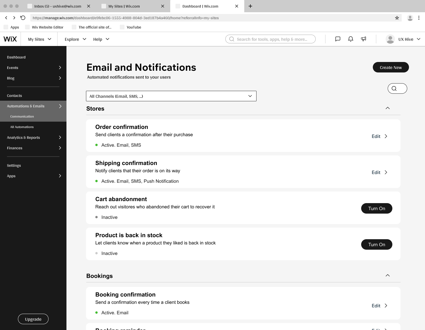
WIREFRAMES
Exploring the structure
I turned the findings into low-fidelity wireframes, focusing on a scannable list view, clear per-automation statistics, and an aggregator that made everything easy to find.
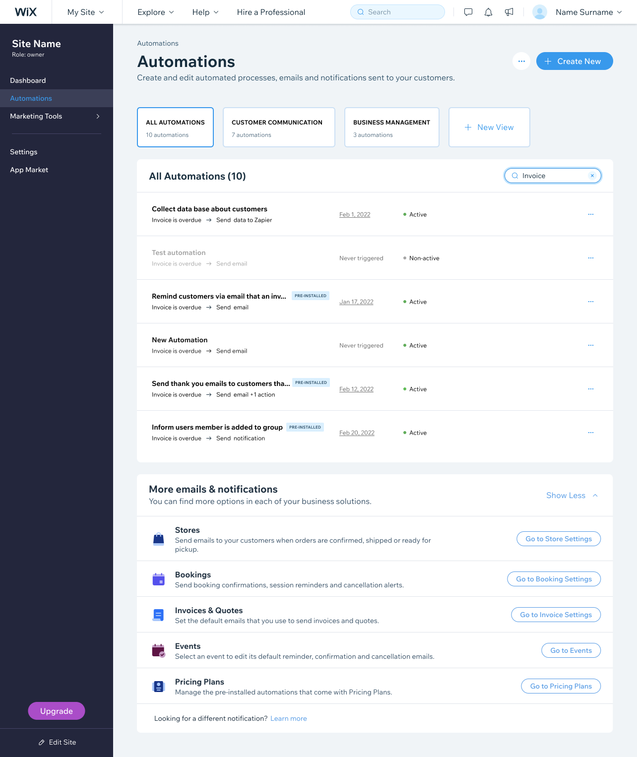
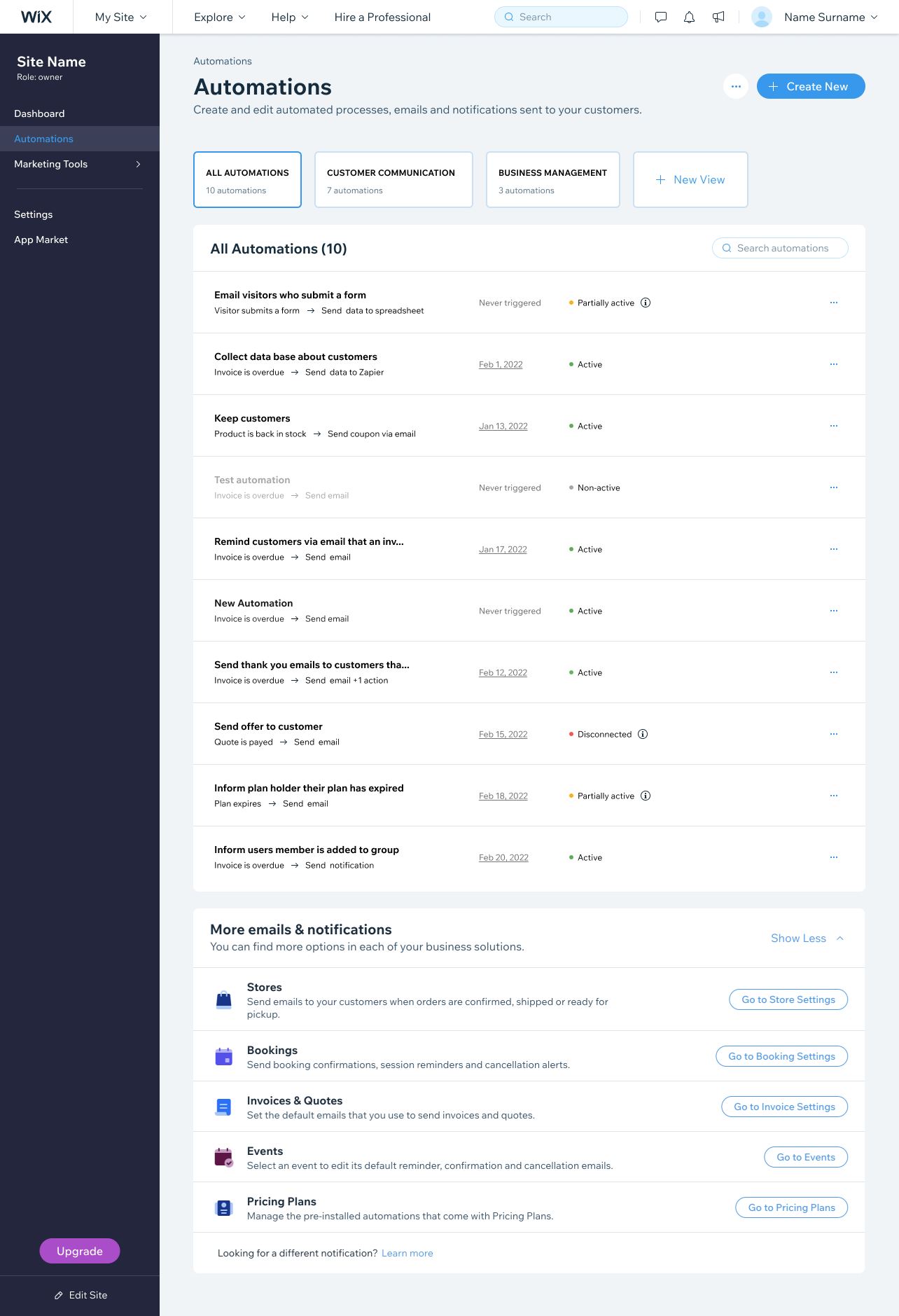
HI-FI SCREENS
The redesigned experience
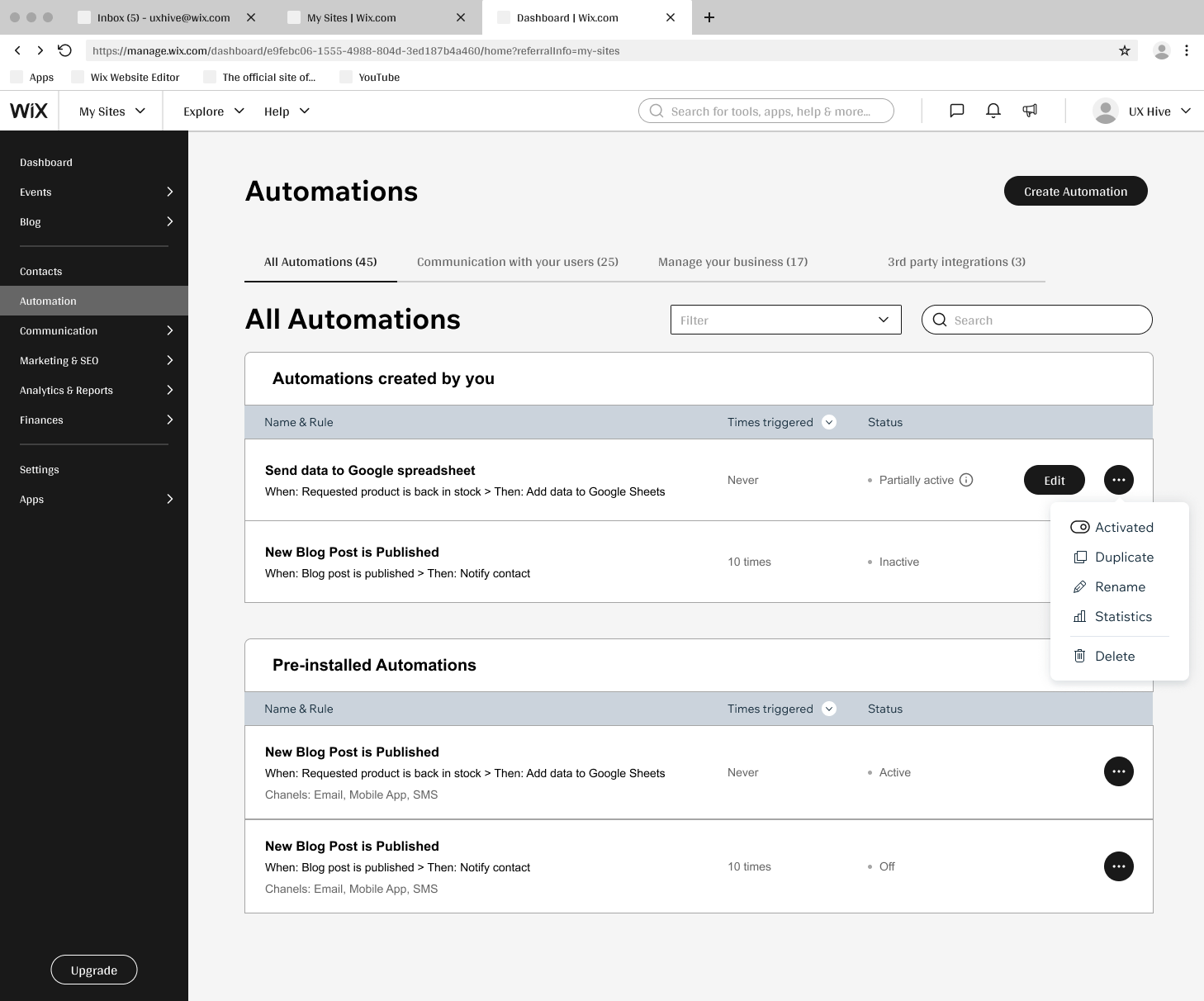
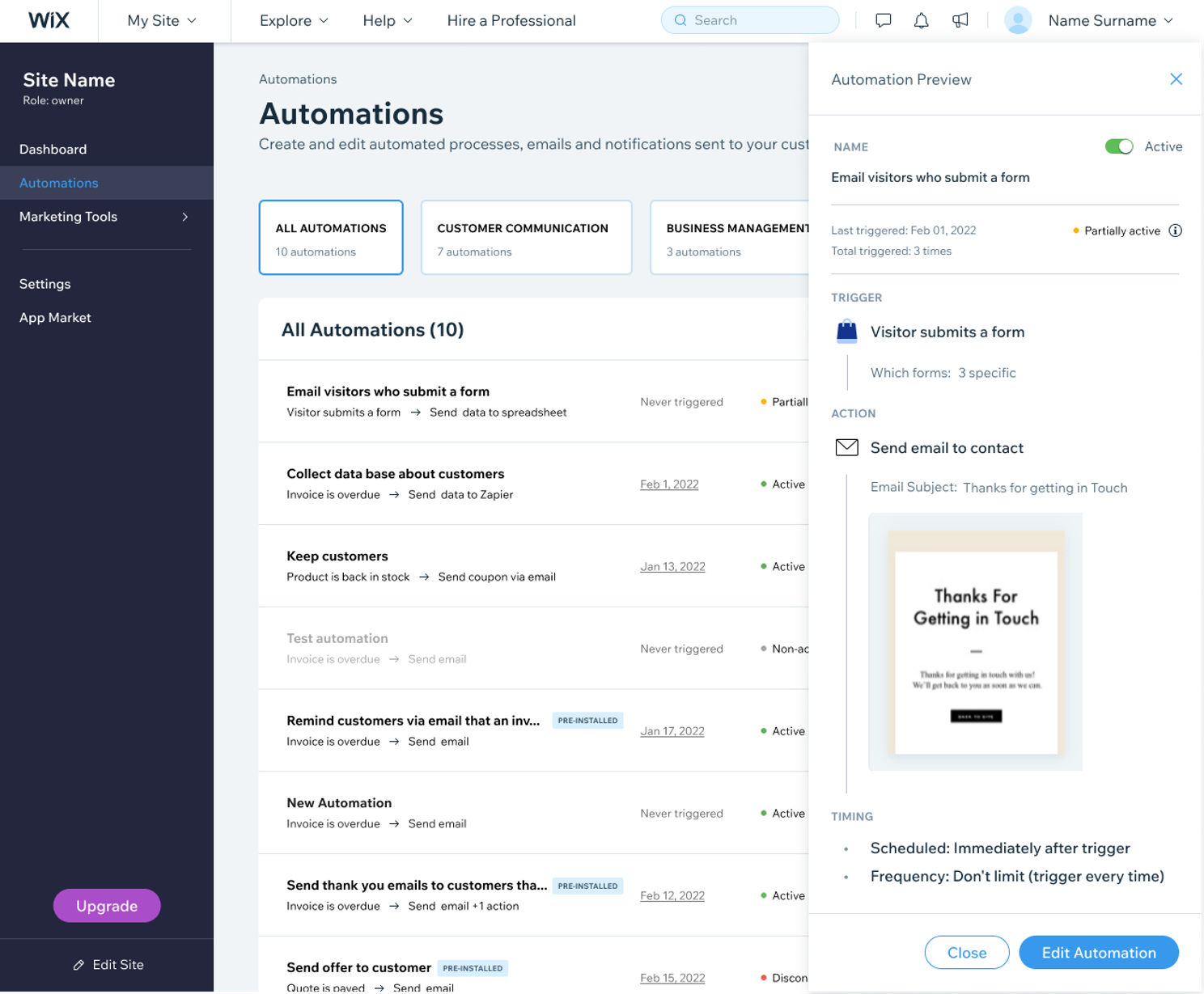
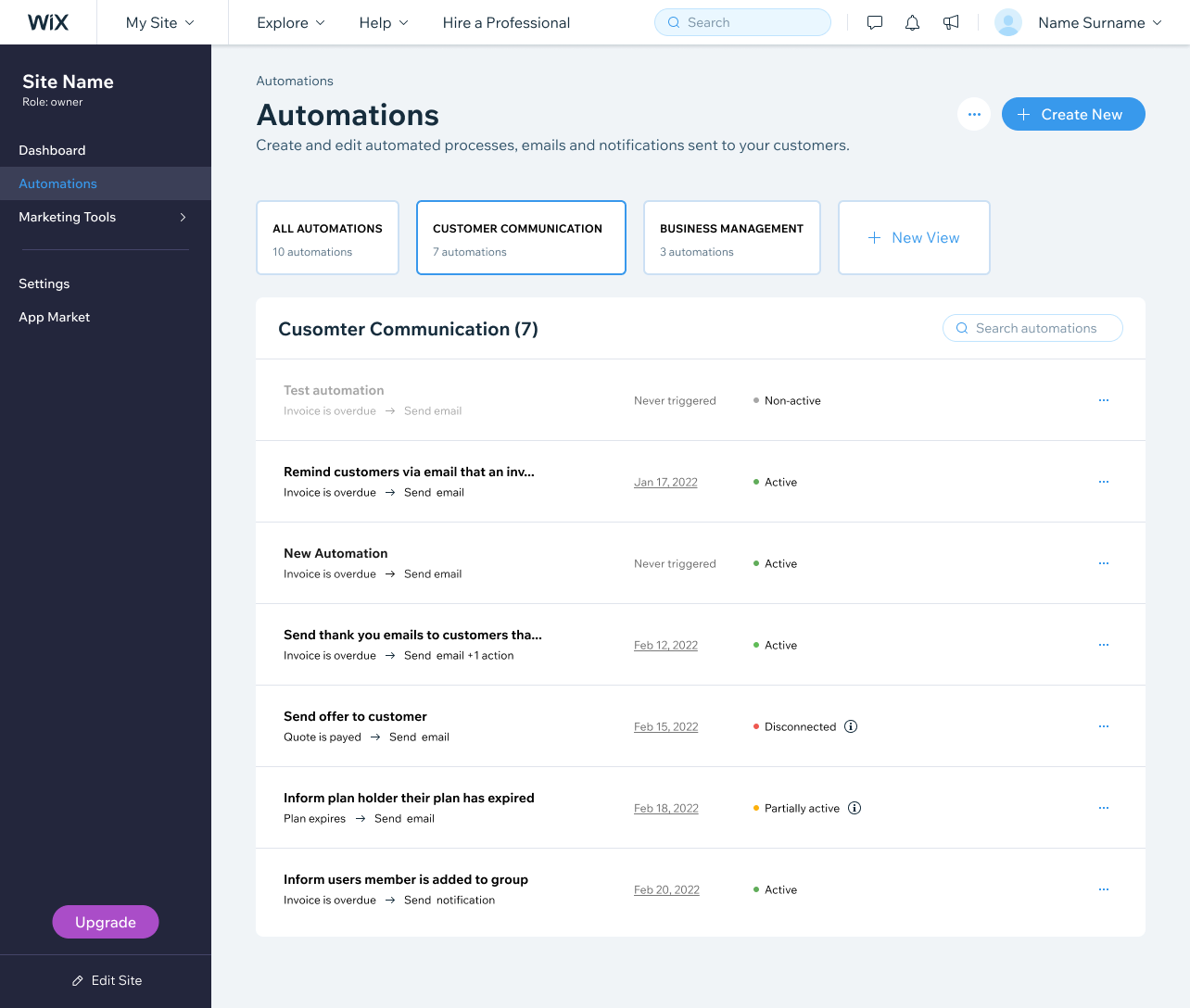
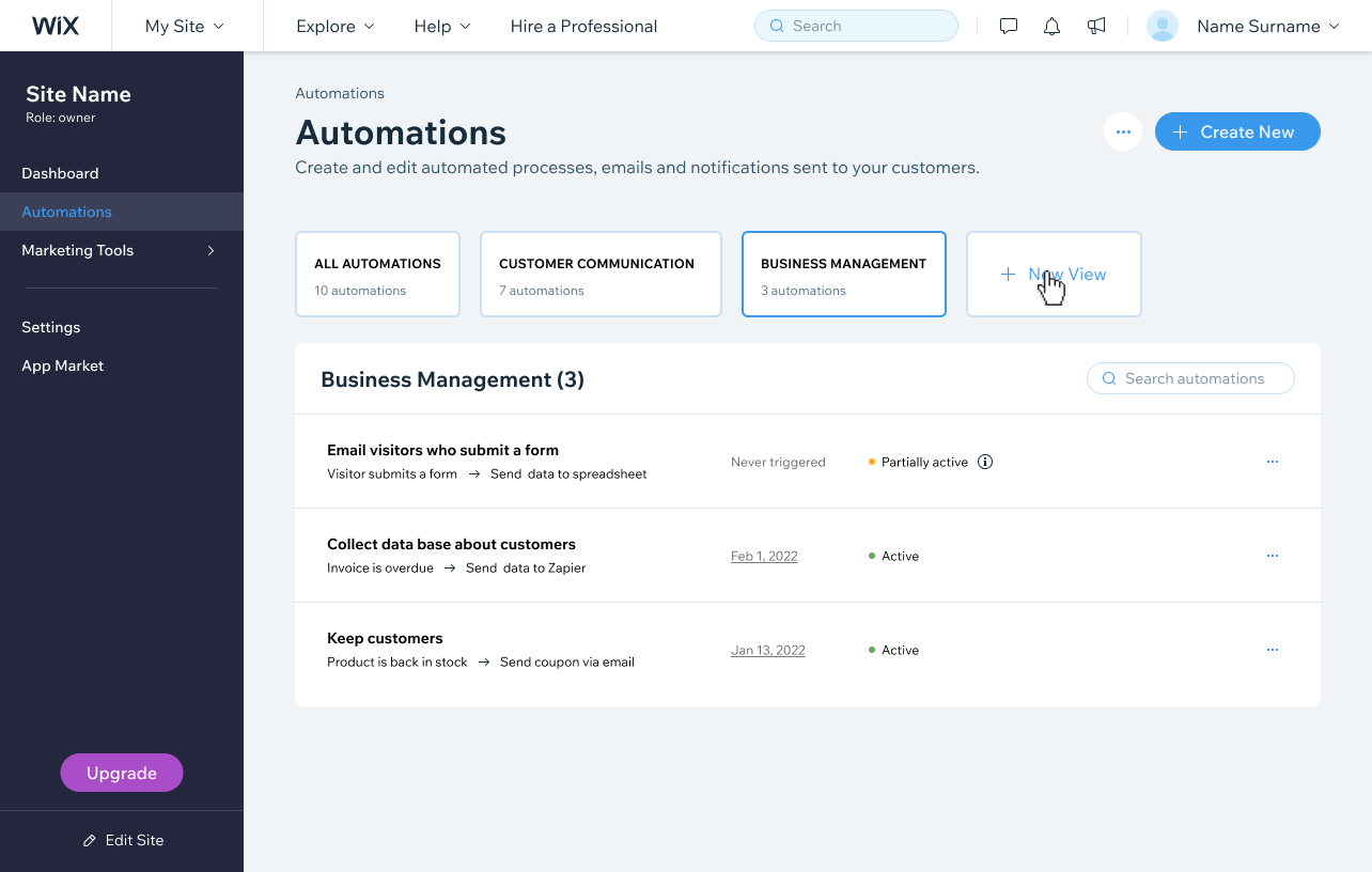
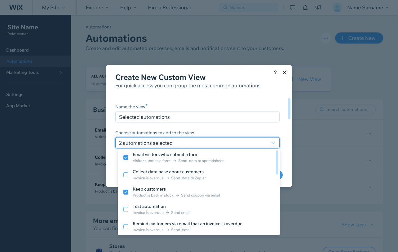
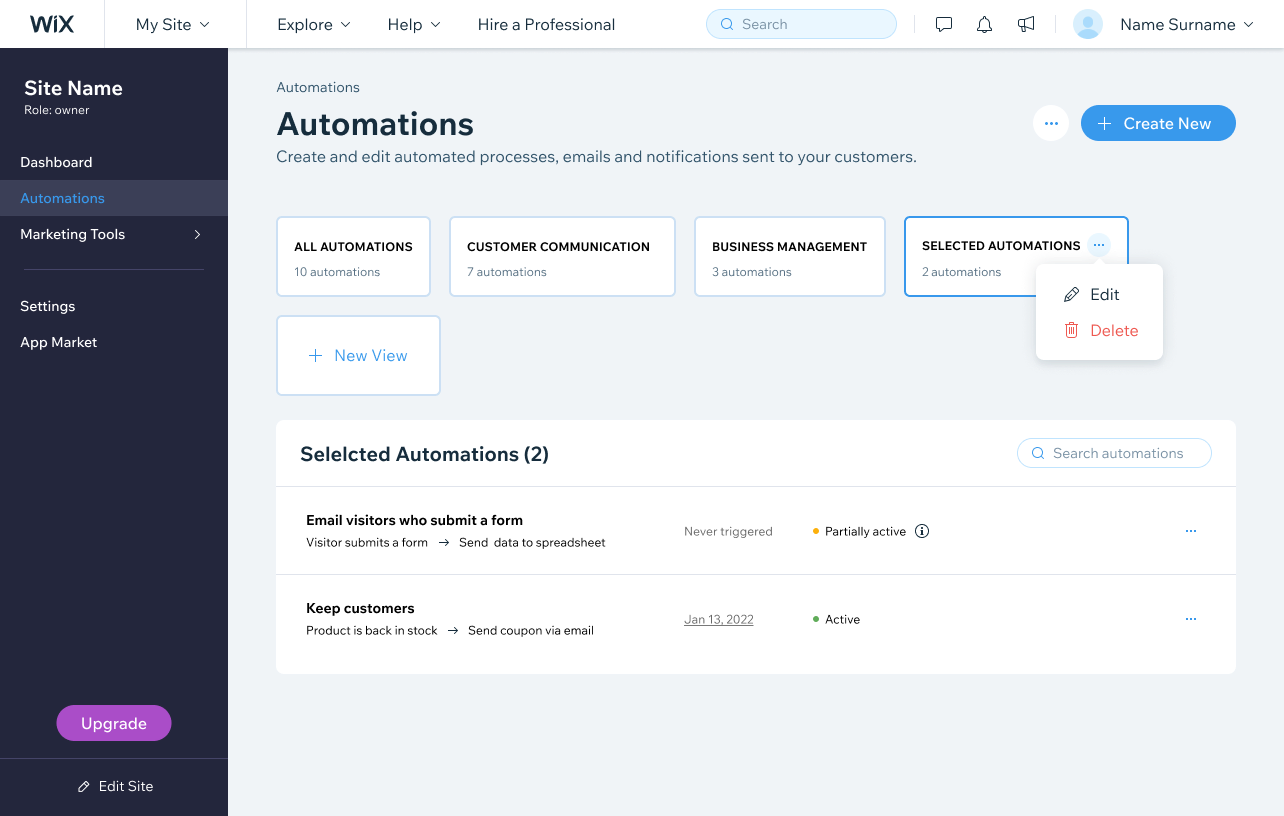
The final design brought Automations into a clear, table-based list with visible statistics, search and sorting, custom views, and recipes to help users start fast.
WHAT CHANGED
What changed
The old Automations was hard to scan, gave no visible proof that an automation was running, and looked different across the products that used it. The redesign turned it into a table-based list with per-automation statistics, search, sorting, custom views, and recipes, so users can find, trust, and create automations faster, in one pattern that stays consistent across Wix.
List view
The format all users preferred, now the default.
Visible stats
Per-automation statistics and indication to prove an automation is running.
Recipes-first
Creation built around recipes, how most users actually start.
One system
Consistent automations template across every Wix product surface.
LEARNINGS
What I took away
Design for the whole platform, not one page.
Automations touches many Wix products, so every decision had to work across teams. Collecting requirements early kept the redesign coherent instead of solving for a single surface.
The research converged.
Competitor scans, support tickets, and usability sessions all pointed to the same needs: scan, trust, and create faster. Triangulating them made the direction hard to argue with.
Show the proof, not just the feature.
The biggest issue wasn’t a missing capability, it was users not seeing that an automation worked. Surfacing simple statistics did more for trust than anything else.
Meet users where they start.
Most people build from recipes, not from a blank canvas. Designing for that reality mattered more than perfecting the from-scratch flow.